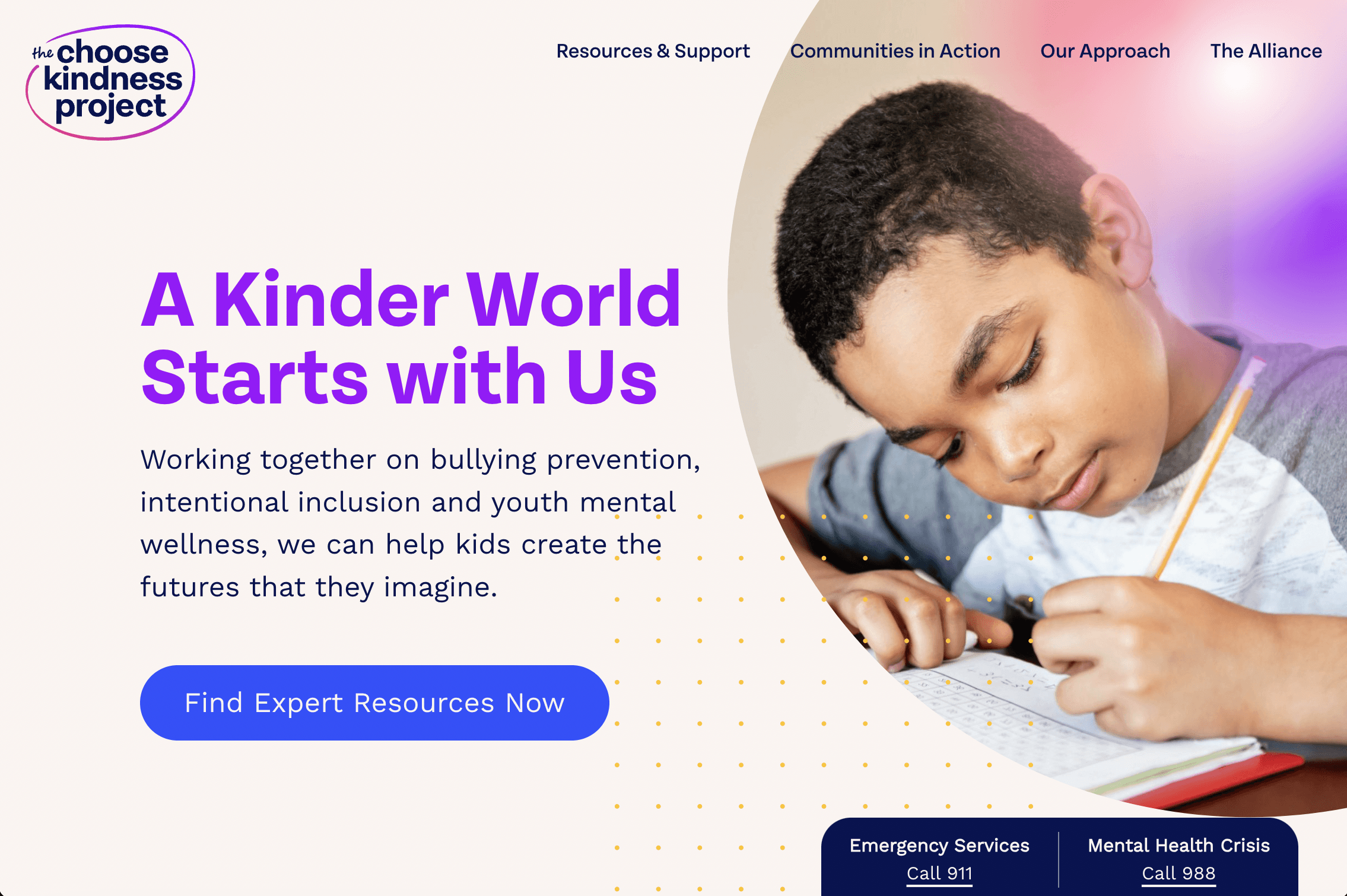
the choose kindness project
How an award-winning site is built
Creating an entirely new site to provide best-in-class support resources for parents, teachers, and coaches to address mental health issues, bullying, and bias.
Client
EIF: Entertainment Industry Foundation
scope
Site Design & Creation
Website
Roles
I worked with and presented to an internal team and the primary client directly. The internal team included:
Strategy & UX Design
Experience Design Dir.
UX Designer (my role)
Design
Digital Creative Director
Art Director
Development
Technical Director
Principal Developer
Project Management
Senior Producer
Process
As a remote/hybrid team, we scheduled full team meetings to check in, review work together, ask questions, avoid surprises, identify challenges in structure, stay ahead of potential issues, and confirm the desired paths were workable.

Stakeholder Interviews

Subject-Expert Interview

Focused Survey
We ran a short survey of adults focused primarily on the experience of seeking (or not seeking) resources on bullying, particularly where the bullying and bullied individuals were both children.
This survey helped us understand the decision-making processes, emotional tensions, and concerns of individuals experiencing these situations so we could structure our communication to be as effective as possible.

Competitive Analysis
To fully comprehend the context in which this site would live and any gaps in currently offered info, we researched several sites offering similar or adjacent content.
From this we discovered content strategy & UX opportunities, including some unique areas in which this site could excel.

Empathy Map
Understanding the audience for this site was especially crucial, so we used an empathy map to clarify the audience experience and perspective: what they were Feeling, Saying/Thinking, Seeing, and Hearing. This helped us tailor the site's language and user flows to best connect with these mindsets.

Pain Points / Potential Gains
Knowing the potential audience's experience (and what this system could offer) helped us keep a clear focus on the features that would make a palpable difference for the audience.

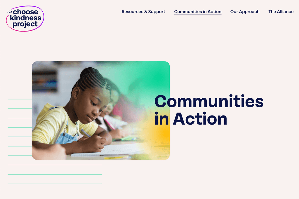
Information Architecture
Using all the knowledge gained in discovery, we laid out the information architecture to maximize ease of orientation, applying a logic that would be intuitive and clear to the primary audiences.

User Flows
Once the IA was laid out, we structured the user flows considering:
Steps each audience type would take
How search/filter would play a role
How emotional states may impact navigation
How to make paths intuitive, efficient, and frictionless

Wireframes & Content Strategy
With flow determined, we began structuring wires for mobile and desktop, then collaborated in a series of reviews with the client to achieve a balance of:
Storytelling
Intuitive interface
Desirable engagement
Overall thoughtful content strategy
We broke full pages into their modular elements, which we then compiled with similar modular elements to confirm consistency and identify any opportunities for simplification.

Additional Iterations
The client was very pleased with the site as structured, but also had additional ideas they wanted to pursue.
After the initial creation, we were honored to be asked to create an entirely new section of the site focused on "Playbooks" for Educators and for Parents.
Following the success of that addition, we were also asked to create the additional structures needed to support multiple languages for the Playbooks.

Future Options
We explored many future iterations for the site! Here are just a few:
Youth Focus
Localization
Interactive Features
App Integration
Training Offerings
Multiple languages (building on what's there)
Global Use
Conclusion
We achieved our initial goal, and structured the site such that it has the capacity to scale and the flexibility to include additional features.
This was an incredibly meaningful project. I couldn't have been more delighted to contribute.

Webby Awards
We were thrilled to learn that the site received a Webby Official Nominee for Best User Interface.

Anthem Awards
We were honored the site received multiple Anthem Awards: one Gold and three Silver.